How do I read a stock market chart?
Why is it important to know how to read a stock market chart?
Stock market graphics are usually the first thing to see when looking for information about an action, but why is it so crucial to be able to read a stock market chart?
In the world of investment, which is quite dynamic and complex, having this competence quickly becomes indispensable in order to be able to make informed decisions. The market charts, they offer both (1) a visualisation of price fluctuations, but also (2) information on market trends.
I know perfectly well that understanding these graphs, whether in candlesticks, lines or bars (more about it in a few paragraphs), may seem complicated at first glance, but it is in the end quite simple. They are essential to assess the historical performance of shares and other financial instruments. In short, it's important if you want to make future forecasts.
But first of all, you need to know that the analysis doesn't stop there. It also includes the use of technical indicators, such as (for example) moving averages or RSI. No worries if you don't know these terms, I'll explain all that in the next paragraphs.
However, you should be aware that interpreting these charts a little too quickly can cost you a lot (see very expensive). Misinterpretation can lead to significant losses. Therefore, it is best to take a little time to be sure to understand them well before making any decision.
Different types of stock market charts
As I have told you, reading a stock chart allows (1) to obtain an overview of price fluctuations, and (2) to have perspectives on the performance of an action. In general, three types are distinguished.
Line charts
Line charts are extremely simple. A continuous line shows how prices vary over time, as you can see in the figure below. Very easy to visualize and interpret, it is the one you will find most often. However, they do not show the opening prices (i.e. the price when the stock exchange opens), and usually only display closing prices (i.e. when the stock exchange closes).
 Line chart using AAPL prices.
Candlesticks charts
Charts in candlesticks (also known as "Japanese candlesticks charts") show much more information than line graphs. Each small candle reveals the opening and closing prices, as well as the extremes of the given period (i.e. the minimum and maximum reached during the day).
A green candle? That means good news: an increase in value. No need to explain that a red candle is not a good sign.
 Candlesticks chart using the prices of the symbol AAPL.
Bar charts
This type of graph illustrates the same details as the chandelier charts, but in a slightly more refined way. Each bar, as for the chandelier chart, shows the price variation for a given period. This is more appropriate if you prefer less complexity without losing in detail.
I hope that this little focus on the types of graphs sheds light on you a little bit more. But now the question is: from a graph, how am I supposed to identify market trends? The answer is quite simple, and I explain it to you in the next section.
 Bar chart using AAPL prices.
Quiz: What type of chart shows opening, closing, but also extreme prices for a given period?
- Line charts
- Pie charts
- Candlesticks charts
- Bubble charts
Trends and support lines/resistance
Okay, all this is very good, but now, how can we use these graphics to invest well? Knowing that they offer an overview of the direction of markets, so you can see this as a compass for your investment decisions. I just need to talk to you about the trends that can be found on these charts, as well as two important lines:
-
Strengths up, down and down: The bullish trends are reflected in increasing peaks and price differentials. For your information, in 2022, the U.S. market recorded an increase of almost 27% for the S&P 500, which clearly reflects an upward trend. On the other hand, downward trends show peaks and declines. In most markets, the trends are often lateral. Prices then fluctuate in a narrow range. Neither rising nor decreasing, just... a lateral phase.
-
Support and resistance lines: Support lines act as a safety net, representing price levels where stocks find demand (and therefore go up). An example? When an action falls but bounces around $50, it may be a support. On the other hand, the resistance slows up the rise in prices (and therefore goes down again).
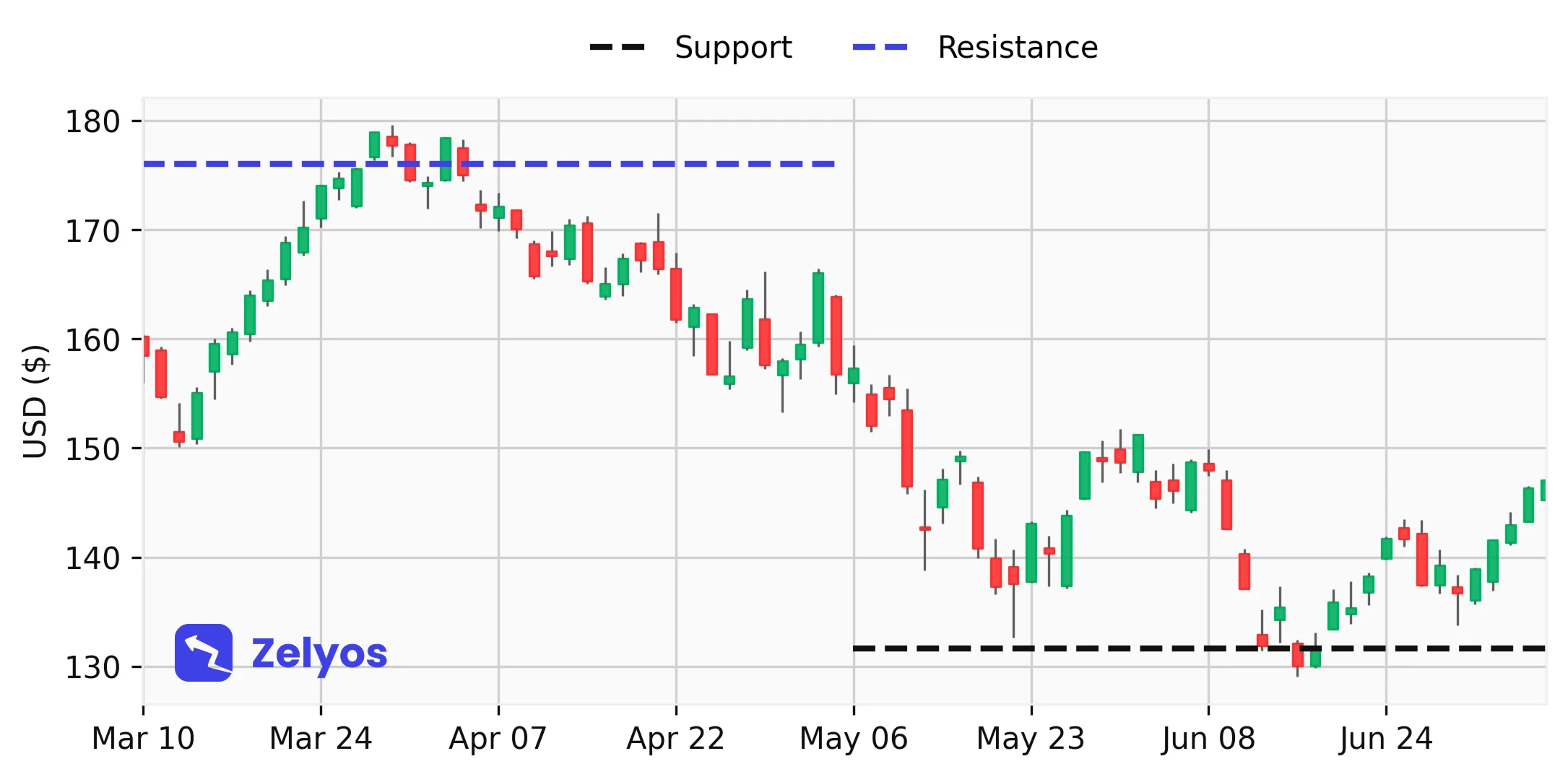 Visual representation of support and resistance lines.
Quiz: Which line often acts as a kind of safety net by representing price levels where stocks find demand and go up?
- Trend lines
- Side lines
- Support lines
- Fluctuation lines
Technical indicators
Obviously, if price data are available, there are obviously certain values which can be calculated from these prices to give indications of the state of the market. This is called indicators, they are important enough to interpret price movements and many investment strategies rely on them. For example, the best known are:
- Mobile averages: The moving averages (the famous SMA and EMA terms that you have most likely already seen) smooth out price fluctuations. A 50-day SMA identifies short-term trends. The same SMA, but over 200 days, gives a much broader view. The Bank of America has even noted that the SMA over 200 days has helped some strategies outperform the market over the long term. Like what, you don't need anything complicated to succeed on the stock market.
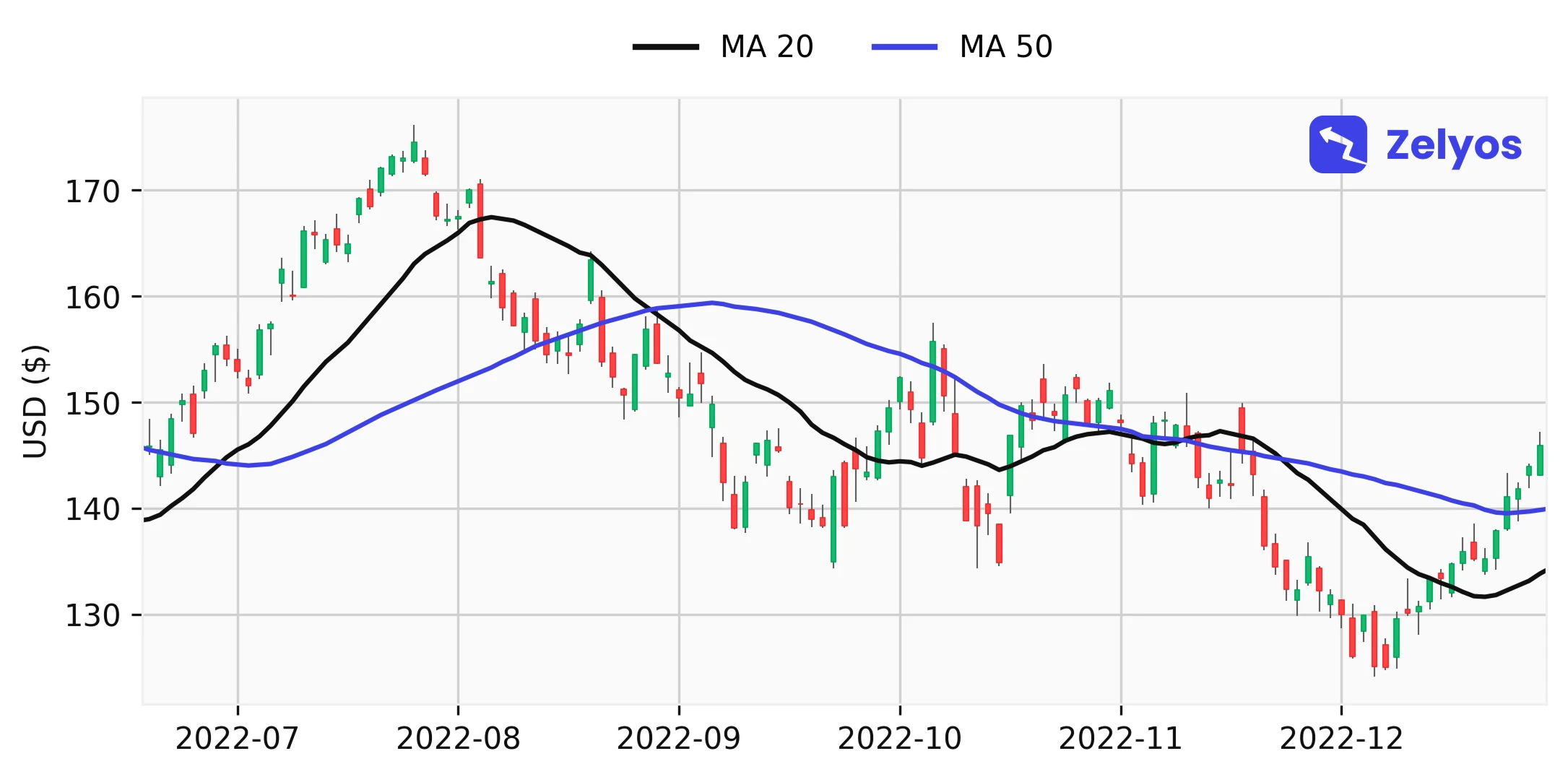 Visual representation of moving averages at 20 and 50 days.
- Relative force index (RSI) : You probably have heard about it, but what is it? It is an oscillator that measures the speed and magnitude of price movements, and it uses a scale of 0 to 100 for that purpose. Beyond 70, the asset could be over-purchased (i.e. it may have experienced a rise too fast and therefore could be "too" bought), below 30, over-sold. Rather interesting, right?
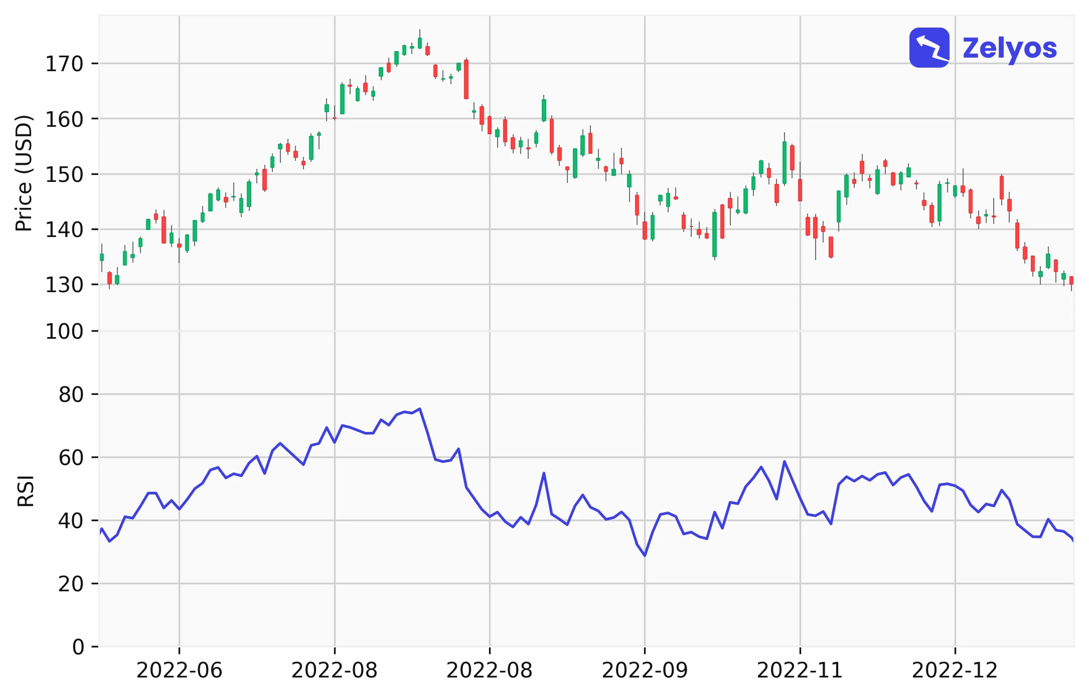 Visual representation of the RSI indicator (bottom) with associated prices (top).
- Bollinger's band: They estimate volatility with a central moving average (in the figure below, a 20-day MA), surrounded by two bands. When they get closer, you have to say, "Be careful, something's getting ready." On the other hand, far-off bands can signal a potential turnaround (and that is quite often stressful...).
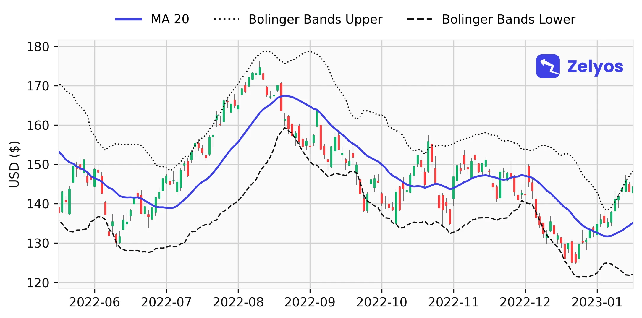 Visual representation of Bollinger bands.
Quiz: Which indicator uses a scale of 0 to 100 to measure the speed and magnitude of price movements?
- Mobile averages (SMA and EMA)
- Bollinger's bands
- Relative Force Index (RSI)
- MACD indicator
What are the common errors when reading a stock market chart?
Even for wise investors, remembering that these tools, while useful, have their limits is crucial.
First, avoid relying solely on graphics. Of course, they offer a visual presentation of trends. It's like a cliché of the past and the present, but not of the future! But how to use these graphs then? Keeping in mind that they must be associated with other analyses, such as the analysis of the fundamentals of the company.
Then don't ignore the external factors. Graphs are useful, I agree, but they don't show the impact of economic or political events. In 2023, with the invasion of Ukraine, we saw how much these external events could disrupt the market. You want to avoid making mistakes? So just make sure you keep up with the world's economic news.
And finally, understand the limitations of the technical indicators. For example, the MACD (another indicator I would not explain here) and the RSI may contradict each other. I know this may seem complex, but just keep in mind that we should not rely solely on these indicators.
Like everything else, in order to invest intelligently, a small, balanced approach is needed. Combine technical analysis, corporate fundamentals and global event monitoring.
Quiz: What is one of the most common errors when reading a stock market chart?
- Relying solely on the fundamentals of the company
- Ignore the company's profits
- Relying exclusively on graphs without taking into account other analyses
- Make sure to keep track of local news only
My last words to become a real pro in reading stock charts
Our initial question was, "Why is it crucial to read the stock market charts well?" So now you know that, for every investor, it's an essential skill to optimize his investment decisions. You can see that as learning a new language. The more you practice, the better you understand.
Regular practice with online graphs, candlesticks or bars improves your ability to analyze the market. Understanding a market chart not only improves your decisions but also your insurance (a little boost to your ego too, let's admit it. You can now boast about this new skill in the evening).
Of course, the charts are only part of the game. They are usually the entry point to the rest of the analysis. It is essential not to ignore the other factors, which are fundamental: business health, economic conditions, etc.
Remember that, learning to invest is a marathon, not a sprint. And as I said before, continuously training is the key.